Since I started making digital art in college I’ve wanted the ability to create cover worthy images, poster worthy images, images that can carry the weight of something. I tried some covers back when I was on DeviantArt and then again when I started my first football blog but I just didn’t have the artistic chops. Things came together recently and I’ve had some fun producing this set. I always think things can be better but I genuinely like some of these executions. I have the most fun making the aged texture, it’s crazy how much it makes something pop. I used to use coffee stain images and paper textures for this but with Procreate I can now draw my texture with brushes and get way more engaging results. I’m reading a book on the history of Penguin covers now so expect some more attempts in future. Enjoy!
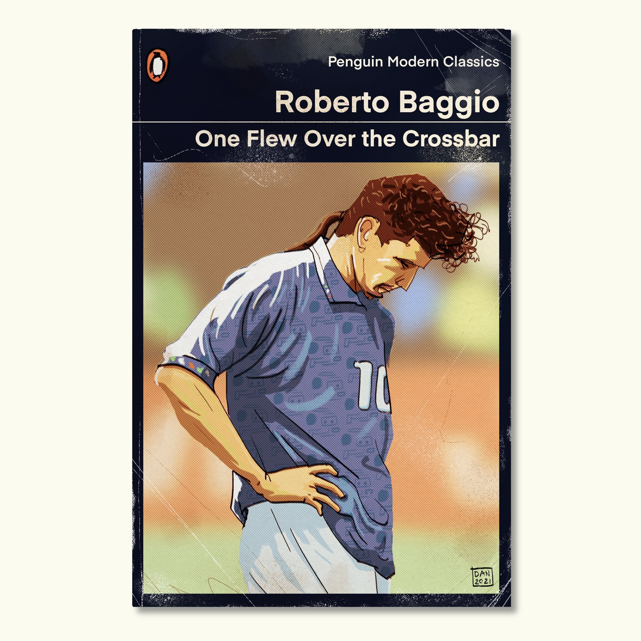
This cover grid is my favourite type. It’s used on an old copy of ‘Tortilla Flat’ by John Steinbeck and I adore it. There’s nothing better than giving artwork prominence and room to breathe. With this artwork I wanted to capture the hazy sun of that day in California when Baggio ballooned the ball. The blurred background helps focus the viewer on the subject and reinforces the fact it’s all about him at that painful moment.
I think there’s something funny about Haaland posing in a noble fashion for a book with an apparently high minded subject. I adapted the Murakami title which was adapted from the Carver title. From his interviews I get the sense that when Haaland talks about goalscoring that is in fact all he’s talking about.
Jamie Vardy, a hero to Leicester fans, a type of antihero to others. I tried to render him with an extra reddish foxy hue and gave him purposefully angular features in a vague attempt to summon a snout. His hair was a great chance to slyly emulate a foxes tail.
Another cover style I love, the text over the image always catches my eye in book shops. I made this amidst Liverpool’s crisis season and felt that the title captures the personality of Klopp but the story of the novel also mirrors the fall from grace he has had to endure; something once great in reduced circumstances. Quite happy with the layout of the cover here, if I saw this I’d pick it up straight away but then again I am a lunatic Liverpool fan.
I tried hardest on this one, maybe pushing the link between Cantona, Seagulls and sardines too far to link with the title. I do love how the artwork looks in the bottom left hand corner of the cover if you zoom in with the halftone mixed with an aged texture and the rich colours.
If you’ve read Zlatan’s autobiography or heard any interview with him you will know he exists to inflate stories in a way that reflects well on himself. I renamed his autobiography to reflect this habit and his height. The repeated use of his portrait was to show the multiple versions of him that need to exist depending on what type of story he’s telling.
Ronaldo is a very hard guy to draw. After many tweaks, false dawns and dead ends I arrived at a pretty good likeness. It feels like the eyes are right and that’s always the heart of a resemblance.
Based on the cover design of the controversial book of cartoons ‘Massacre’ by Siné. I went with the most obvious title and just had fun drawing the wild side profile.


